Presence Insights
Understand the Usage Details table, location charts, and average attendance metrics in the Presence Dashboard.
The Presence Dashboard provides three analytics views, each offering a different perspective on attendance data.
Usage Details
The top section of the dashboard shows a per-user table of daily presence activity.
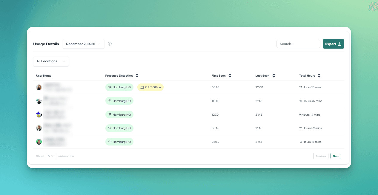
What It Shows
For each user detected on the selected day:
| Column | Description |
|---|---|
| User | Employee name and email. |
| First Detected | Time of the earliest presence event on that day. |
| Last Detected | Time of the latest presence event on that day. |
| Duration | Approximate hours of presence (based on first/last detection). |
| Locations | Which presence locations the user was detected at. |
Filtering and Search
- Date picker -- Select any single day to view that day's activity.
- Search -- Find specific users by name or email.
- Team filter -- Show only users from a specific team.
Export
Click the Export button to download the data as a CSV file. You can export a single day or a date range.
Presence by Location
Below the usage table, a chart shows the number of detected users per presence location per day.
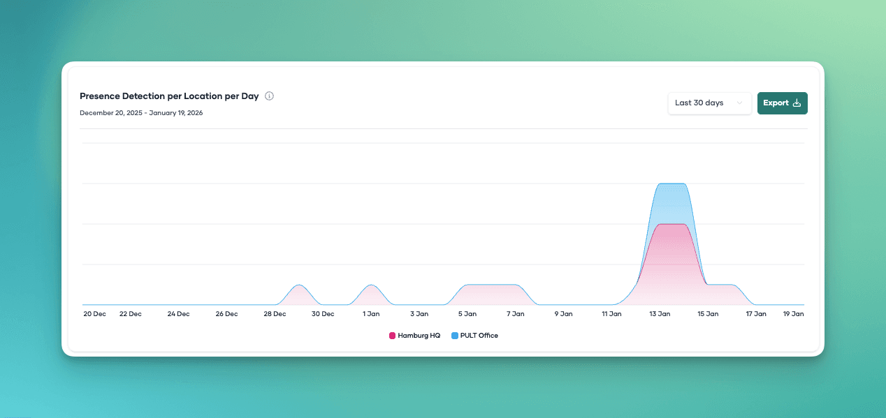
What It Shows
- Each presence location is shown as a separate line or bar in the chart.
- The X-axis shows days, the Y-axis shows the number of users detected.
- The date range is configurable.
This view is useful for:
- Comparing attendance across offices.
- Identifying trends (e.g., which days are busiest).
- Planning office capacity based on actual usage.
Export
Click Export to download the chart data as CSV, containing per-location user counts for each day in the range.
Average Attendance
At the bottom of the dashboard, the Average Attendance section shows a grid of per-user average attendance over a configurable time period.
What It Shows
Each tile represents a user and shows their average attendance percentage (or number of presence days) over the selected time range.
Filtering Options
| Filter | Description |
|---|---|
| Time range | Preset options (last week, 2 weeks, 4 weeks, etc.) or a custom date range. |
| Team | Filter by a specific team. When a team is selected, a team average tile is also shown. |
| Location | Filter by a specific presence location. |
| Exclude absences | Exclude specific day types from the calculation (see below). |
| Exclude weekdays | Exclude specific days of the week (e.g., weekends). |
| Sort | Sort by attendance ascending or descending. |
Excluding Absences

To get accurate attendance averages, you can exclude certain absence types from the calculation:
- Vacation -- Vacation days are not counted as days the user was expected to be present.
- Sick leave -- Sick days are excluded from the expected total.
- Other leave -- Custom leave types.
- Public holidays -- Holidays are excluded from the expected total.
How it works: When an absence type is excluded, days of that type are removed from the denominator when calculating the attendance percentage. This prevents vacation or sick days from artificially lowering a user's attendance rate.
Example: If a user had 20 working days in a month, was present for 15, and took 5 vacation days:
- Without exclusion: 15/20 = 75% attendance
- With vacation excluded: 15/15 = 100% attendance
Export
Click Export to download the average attendance data as CSV.
Last updated on Apr 20, 2026, 10:32 PM